Introduction
This notebook covers the functionality of the Basic Mapping section of the GeoDa workbook. We refer to that document for details on the methodology, references, etc. The goal of these notes is to approximate as closely as possible the operations carried out using GeoDa by means of a range of R packages.
The notes are written with R beginners in mind, more seasoned R users can probably skip most of the comments on data structures and other R particulars. Also, as always in R, there are typically several ways to achieve a specific objective, so what is shown here is just one way that works, but there often are others (that may even be more elegant, work faster, or scale better).
For this notebook, we will continue to use the socioeconomic data for 55 New York City sub-boroughs from the GeoDa website.
Objectives
After completing the notebook, you should know how to carry out the following tasks (some of these were also covered in the spatial data handling notes):
Reading and loading a shapefile
Creating choropleth maps for different classifications
Customizing choropleth maps
Selecting appropriate color schemes
Calculating and plotting polygon centroids
Composing conditional maps
Creating a cartogram
R Packages used
sf: to manipulate simple features
tmap: to create and customize choropleth maps
RColorBrewer: to select color schemes
cartogram: to construct a cartogram
R Commands used
Below follows a list of the commands used in this notebook. For further details and a comprehensive list of options, please consult the R documentation.
Base R:
setwd,install.packages,library,summary,quantile,function,unname,vector,floor,ceiling,cut,as.factor,as.character,as.numeric,which,length,rev,uniquesf:
st_read,st_crs,plot,st_centroid,st_write,st_set_geometry(NULL)tmap:
tm_shape,tm_polygons,tm_fill,tm_borders,tm_layout,tmap_mode,tm_basemap,tmap_save,tm_dots,tm_facetsRColorBrewer:
brewer.pal,display.brewer.palcartogram:
cartogram_dorling,cartogram_cont,cartogram_ncont
Preliminaries
Before starting, make sure to have the latest version of R and of packages that are compiled for the matching version of R (this document was created using R 3.5.1 of 2018-07-02). Also, make sure to set a working directory.2 We will use a relative path to the working directory to read the data set.
Load packages
First, we load all the required packages using the library command. If you don’t have some of these in your system, make sure to install them first as well as their dependencies.3 You will get an error message if something is missing. If needed, just install the missing piece and everything will work after that.
library(sf)## Linking to GEOS 3.6.1, GDAL 2.1.3, proj.4 4.9.3library(tmap)
library(RColorBrewer)
library(cartogram)Obtaining the data
The data set used to implement the operations in this workbook is the same as the one we used for exploratory data analysis. The variables are contained in NYC Data on the GeoDa support web site. After the file is downloaded, it must be unzipped (e.g., double click on the file). The nyc folder should be moved to the current working directory for the path names we use below to work correctly.
We use the st_read command from the sf package to read in the shape file information. This provides a brief summary of the geometry of the layer, such as the path (your path will differ), the driver (ESRI Shapefile), the geometry type (MULTIPOLYGON), bounding box and projection information. The latter is contained in the proj4string information.
nyc.bound <-st_read("nyc/nyc.shp")## Reading layer `nyc' from data source `/Users/luc/github/spatialanalysis/lab_tutorials/nyc/nyc.shp' using driver `ESRI Shapefile'
## Simple feature collection with 55 features and 34 fields
## geometry type: MULTIPOLYGON
## dimension: XY
## bbox: xmin: 913037.2 ymin: 120117 xmax: 1067549 ymax: 272751.4
## epsg (SRID): NA
## proj4string: +proj=lcc +lat_1=40.66666666666666 +lat_2=41.03333333333333 +lat_0=40.16666666666666 +lon_0=-74 +x_0=300000.0000000001 +y_0=0 +datum=NAD83 +units=us-ft +no_defsThe projection in question is the ESRI projection 102718, NAD 1983 stateplane New York Long Island fips 3104 feet. It does not have an EPSG code (see the spatial data handling notes for further details on projections), but it has a valid proj4string. So, as long as we don’t change anything, we should be OK. We can double check the projection information with st_crs:
st_crs(nyc.bound)## Coordinate Reference System:
## No EPSG code
## proj4string: "+proj=lcc +lat_1=40.66666666666666 +lat_2=41.03333333333333 +lat_0=40.16666666666666 +lon_0=-74 +x_0=300000.0000000001 +y_0=0 +datum=NAD83 +units=us-ft +no_defs"As we saw in the spatial data handling notes, we can create a quick map using the sf plot command. This will result in a choropleth map for the first few variables in the data frame.
plot(nyc.bound)## Warning: plotting the first 9 out of 34 attributes; use max.plot = 34 to
## plot all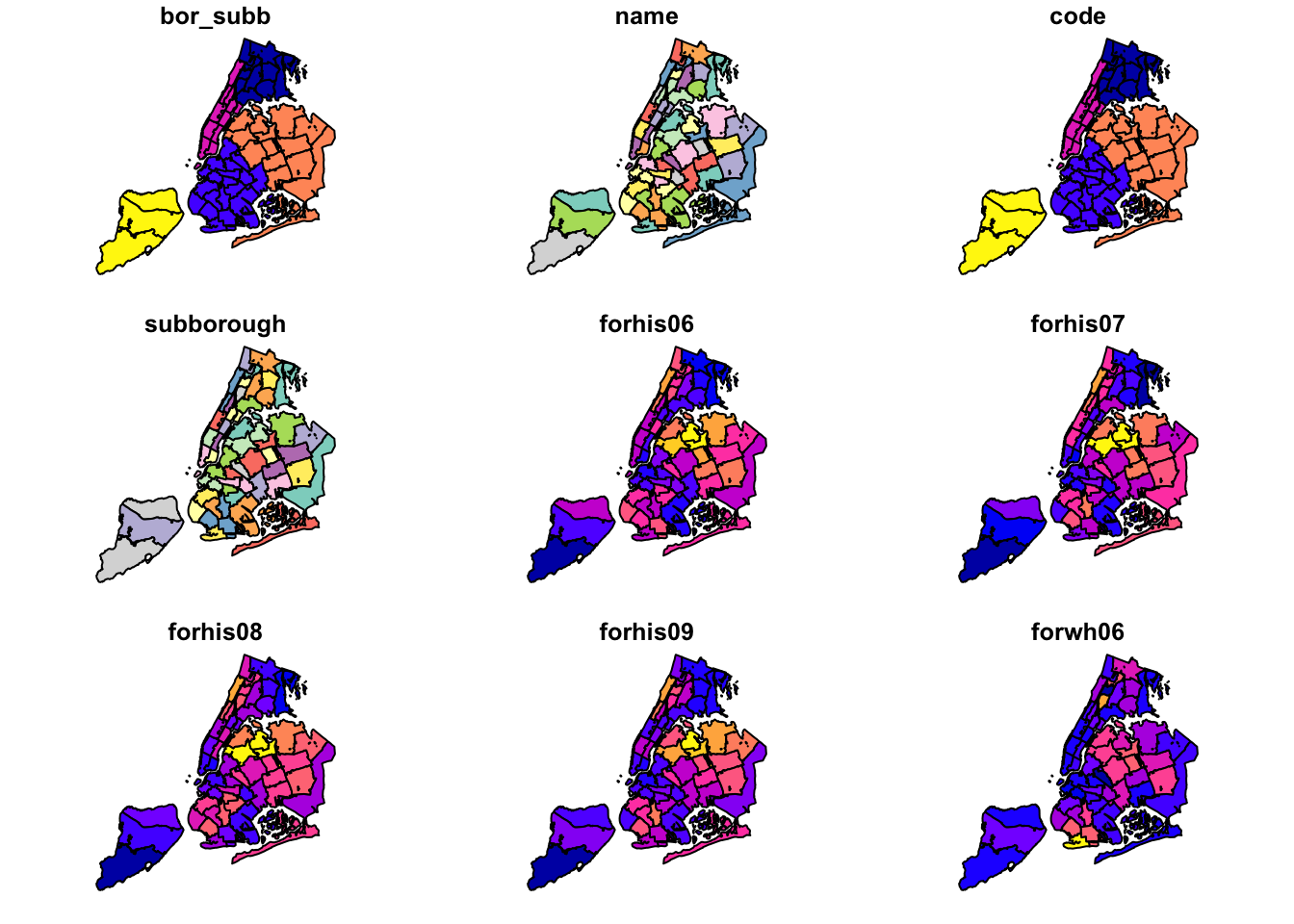
Basic Choropleth Mapping
We now turn to the choropleth mapping functionality included in the tmap package. We have already covered some functionality of tmap in the spatial data handling notes. Here, we will explore some further customizations.
The tmap package is extremely powerful, and there are many features that we do not cover. Detailed information on tmap functionality can be found at tmap documentation. In addition, several extensive examples are listed in the review in the Journal of Statistical Software by Tennekes (2018). Another useful resource is the chapter on mapping in Lovelace, Nowosad, and Muenchow’s Geocomputation with R book.
Default settings
We have already seen (in the spatial data handling notes) that tmap uses the same layered logic as ggplot. The initial command is tm_shape, which specifies the geography to which the mapping is applied. This is followed by a number of tm_* options that select the type of map and several optional customizations.
We follow the example in the GeoDa Workbook and start with a basic choropleth map of the rent2008 variable. In tmap there are two ways to create a choropleth map. The simplest one, which we have already seen, is to use the tm_polygons command with the variable name as the argument (under the hood, this is the value for the col parameter). In our example, the map is created with two commands, as shown below. The color coding corresponds to style = "pretty", which is the default when the classification breaks are not set explicitly, and the default values are used (see the discussion of map classifications below).
tm_shape(nyc.bound) +
  tm_polygons("rent2008")
The tm_polygons command is a wrapper around two other functions, tm_fill and tm_borders. tm_fill controls the contents of the polygons (color, classification, etc.), while tm_borders does the same for the polygon outlines.
For example, using the same shape (but no variable), whe obtain the outlines of the sub-boroughs from the tm_borders command.
tm_shape(nyc.bound) +
  tm_borders()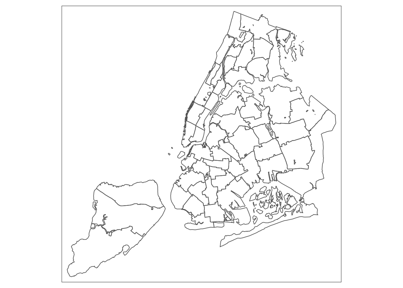
Similarly, we obtain a choropleth map without the polygon outlines when we just use the tm_fill command.
tm_shape(nyc.bound) +
  tm_fill("rent2008")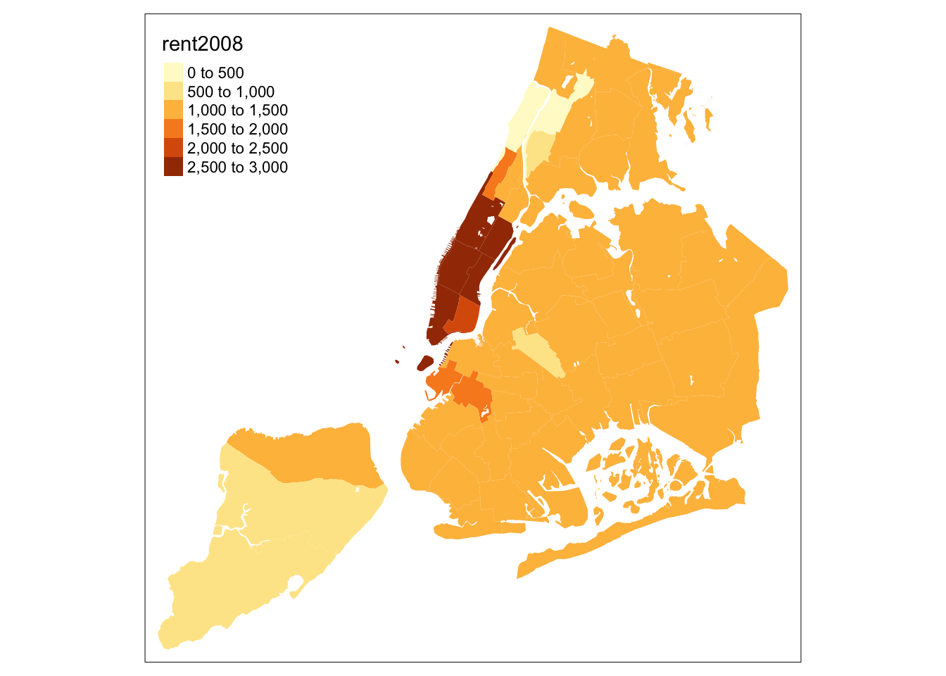
When we combine the two commands, we obtain the same map as with tm_polygons (this illustrates how in R one can often obtain the same result in a number of different ways).
tm_shape(nyc.bound) +
  tm_fill("rent2008") +
  tm_borders()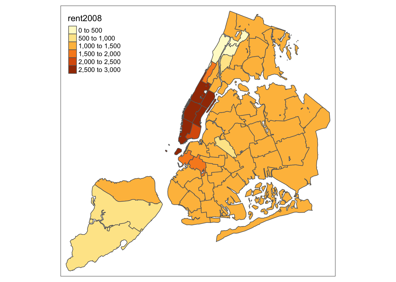
An extensive set of options is available to customize the appearance of the map. A full list is given in the documentation page for tm_fill. In what follows, we briefly consider the most common ones.
Color palette
The range of colors used to depict the spatial distribution of a variable is determined by the palette. The palette is an argument to the tm_fill function. Several built-in palettes are contained in tmap. For example, using palette = "Reds" would yield the following map for our example.
tm_shape(nyc.bound) +
  tm_fill("rent2008",palette="Reds") +
  tm_borders()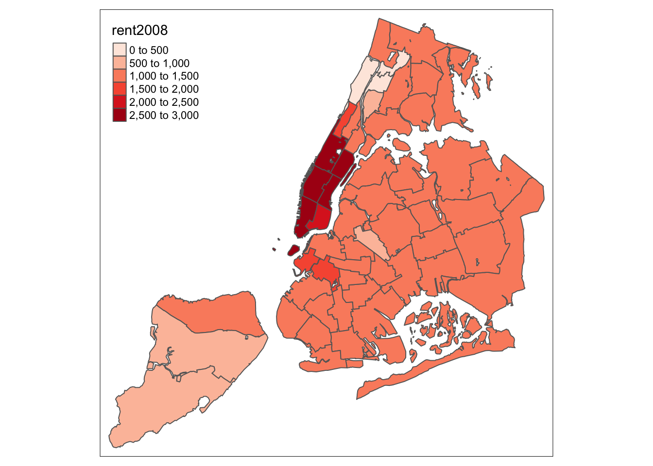
Under the hood, “Reds” refers to one of the color schemes supported by the RColorBrewer package (see below).
Custom color palettes
In addition to the built-in palettes, customized color ranges can be created by specifying a vector with the desired colors as anchors. This will create a spectrum of colors in the map that range between the colors specified in the vector. For instance, if we used c(“red”, “blue”), the color spectrum would move from red to purple, then to blue, with in between shades. In our example:
tm_shape(nyc.bound) +
  tm_fill("rent2008",palette=c("red","blue")) +
  tm_borders()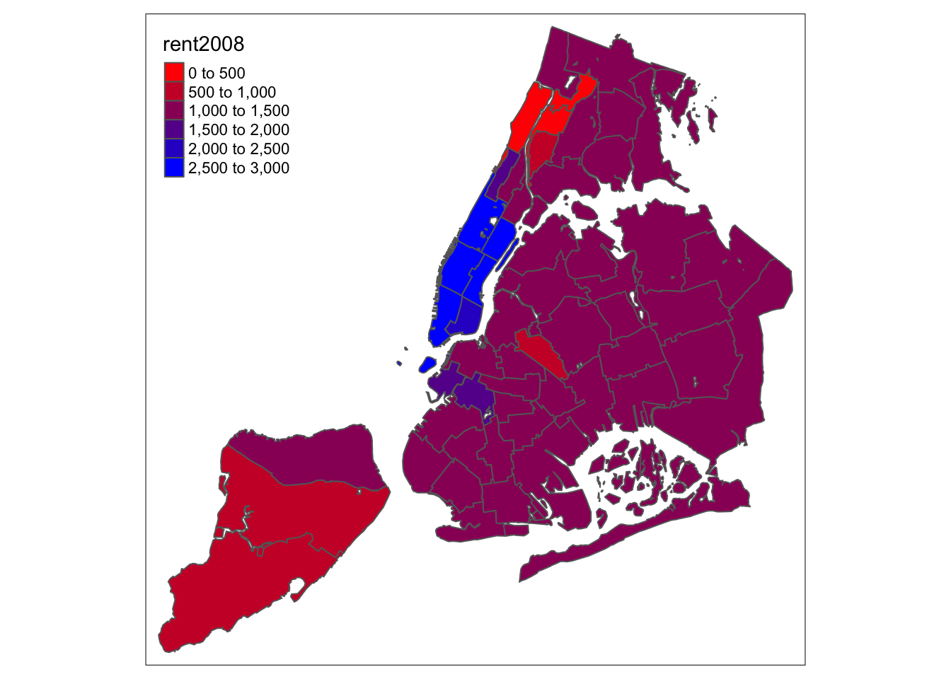
Not exactly a pretty picture. In order to mimic the diverging scale used in many of GeoDa’s extreme value maps, we insert “white” in between red and blue (but see the next section for a better approach).
tm_shape(nyc.bound) +
  tm_fill("rent2008",palette=c("red","white","blue")) +
  tm_borders()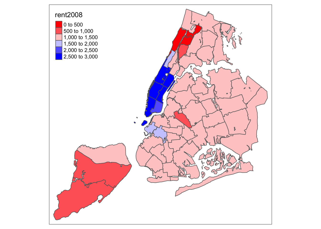
Better, but still not quite there.
ColorBrewer
A preferred approach to select a color palette is to chose one of the schemes contained in the RColorBrewer package. These are based on the research of cartographer Cynthia Brewer (see the colorbrewer2 web site for details). ColorBrewer makes a distinction between sequential scales (for a scale that goes from low to high), diverging scales (to highlight how values differ from a central tendency), and qualitative scales (for categorical variables). For each scale, a series of single hue and multi-hue scales are suggested. In the RColorBrewer package, these are referred to by a name (e.g., the “Reds” palette we used above is an example). The full list is contained in the RColorBrewer documentation.
There are two very useful commands in this package. One sets a color palette by specifying its name and the number of desired categories. The result is a character vector with the hex codes of the corresponding colors.
For example, we select a sequential color scheme going from blue to green, as BuGn, by means of the command brewer.pal, with the number of categories (6) and the scheme as arguments. The resulting vector contains the HEX codes for the colors.
pal <- brewer.pal(6,"BuGn")
pal
## [1] "#EDF8FB" "#CCECE6" "#99D8C9" "#66C2A4" "#2CA25F" "#006D2C"Using this palette in our map yields the following result.
tm_shape(nyc.bound) +
  tm_fill("rent2008",palette="BuGn") +
  tm_borders()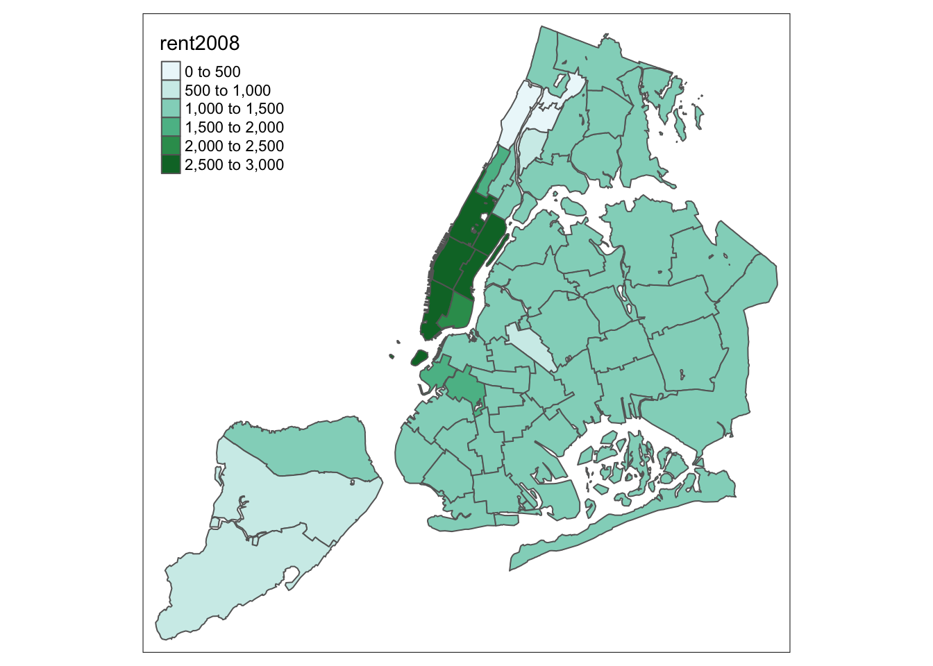
The command display.brewer.pal allows us to explore different color schemes before applying them to a map. For example:
display.brewer.pal(6,"BuGn")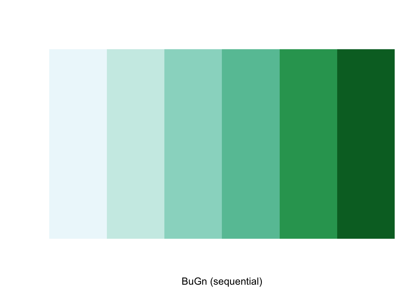
Legend
There are many options to change the formatting of the legend entries through the legend.format argument. We refer to the tm_fill documentation for specific details.
Often, the automatic title for the legend is not that attractive, since it is simply the variable name. This can be customized by setting the title argument to tm_fill. For example, keeping all the other settings to the default, we change the legend to Rent in 2008.
tm_shape(nyc.bound) +
  tm_fill("rent2008",title="Rent in 2008") +
  tm_borders()
Another important aspect of the legend is its positioning. This is handled through the tm_layout function. This function has a vast number of options, as detailed in the documentation. There are also specialized subsets of layout functions, focused on specific aspects of the map, such as tm_legend, tm_style and tm_format. We illustrate the positioning of the legend.
The default is to position the legend inside the map. Often, this default solution is appropriate, but sometimes further control is needed. The legend.position argument to the tm_layout function takes a vector of two string variables that determine both the horizontal position (“left”, “right”, or “center”) and the vertical position (“top”, “bottom”, or “center”).
For example, if we would want to move the legend to the lower-right position (clearly inferior to the default solution), we would use the following set of commands.
tm_shape(nyc.bound) +
  tm_fill("rent2008",title="Rent in 2008") +
  tm_borders() +
  tm_layout(legend.position = c("right", "bottom"))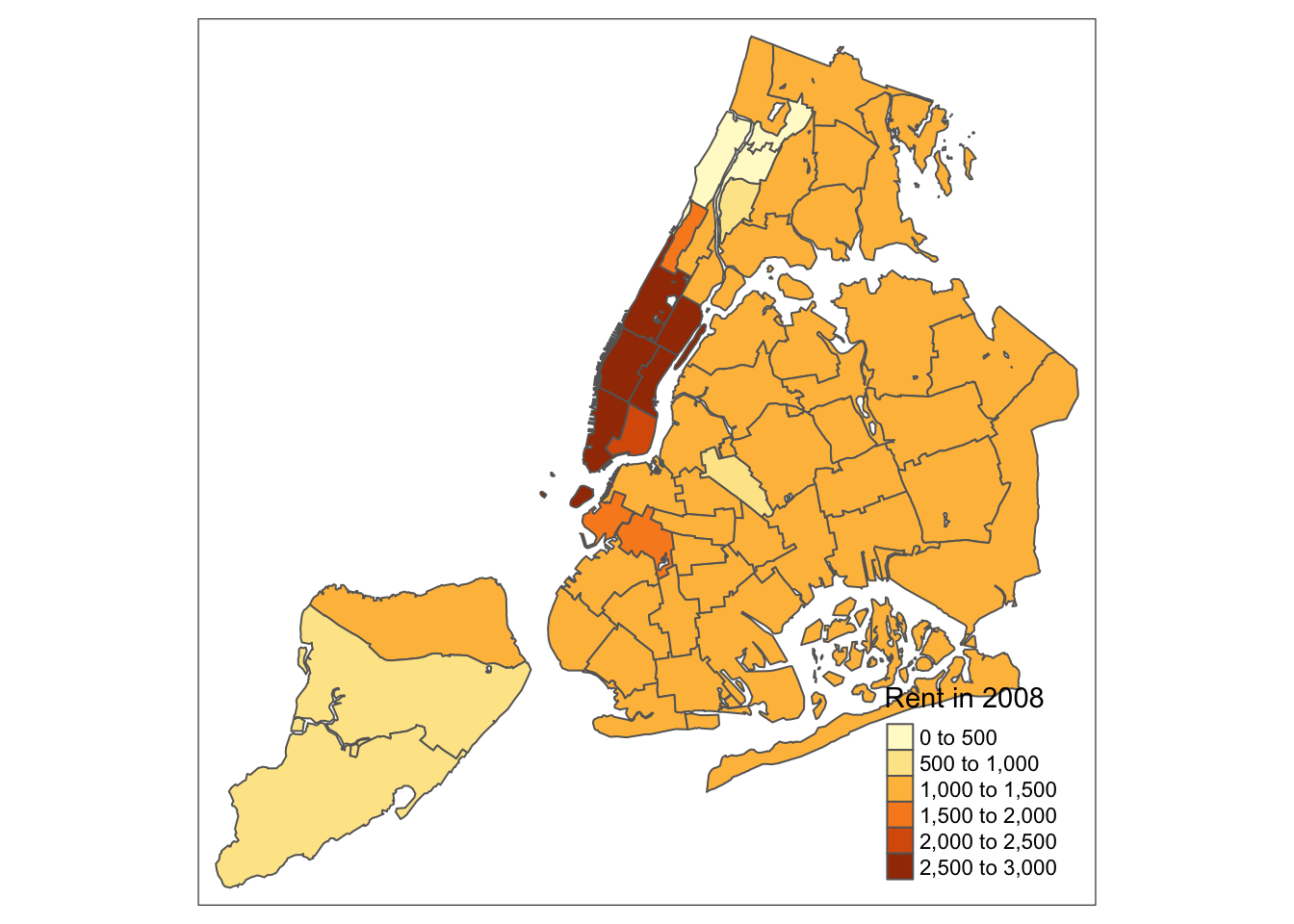
There is also the option to position the legend outside the frame of the map. This is accomplished by setting legend.outside to TRUE (the default is FALSE), and optionally also specify its position by means of legend.outside.position. The latter can take the values “top”, “bottom”, “right”, and “left”.
For example, to position the legend outside and on the right, would be accomplished by the following commands.
tm_shape(nyc.bound) +
  tm_fill("rent2008",title="Rent in 2008") +
  tm_borders() +
  tm_layout(legend.outside = TRUE, legend.outside.position = "right")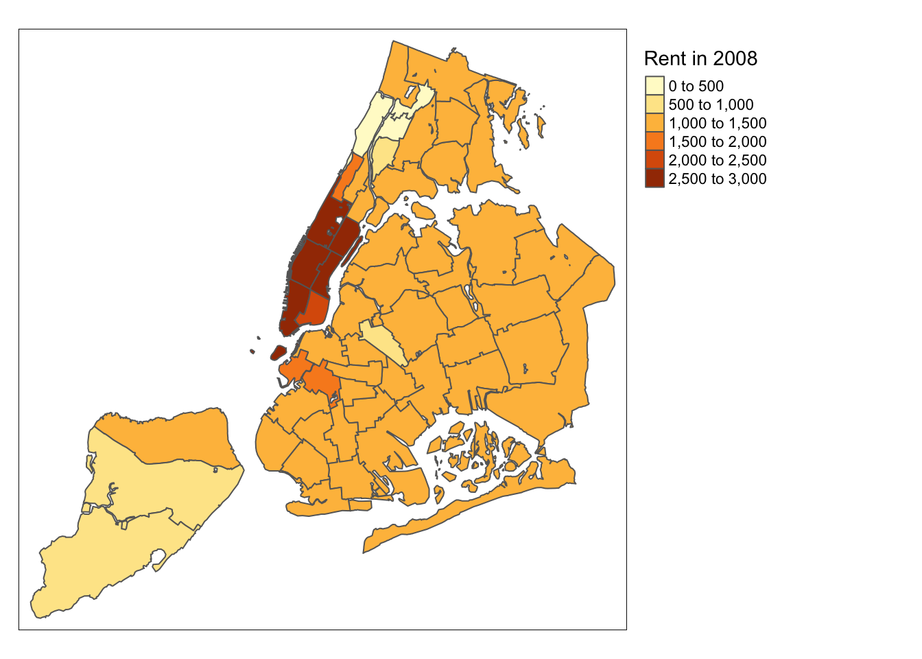
We can also customize the size of the legend, its alignment, font, etc. We refer to the documentation for specifics.
While there is no obvious way to show the number of observations in each category (as is the case in GeoDa), tmap has an option to add a histogram to the legend. This is accomplished by setting legend.hist=TRUE in the tm_fill command. Further customization is possible, but is not covered here.
tm_shape(nyc.bound) +
  tm_fill("rent2008",title="Rent in 2008",legend.hist=TRUE) +
  tm_borders() +
  tm_layout(legend.outside = TRUE, legend.outside.position = "right")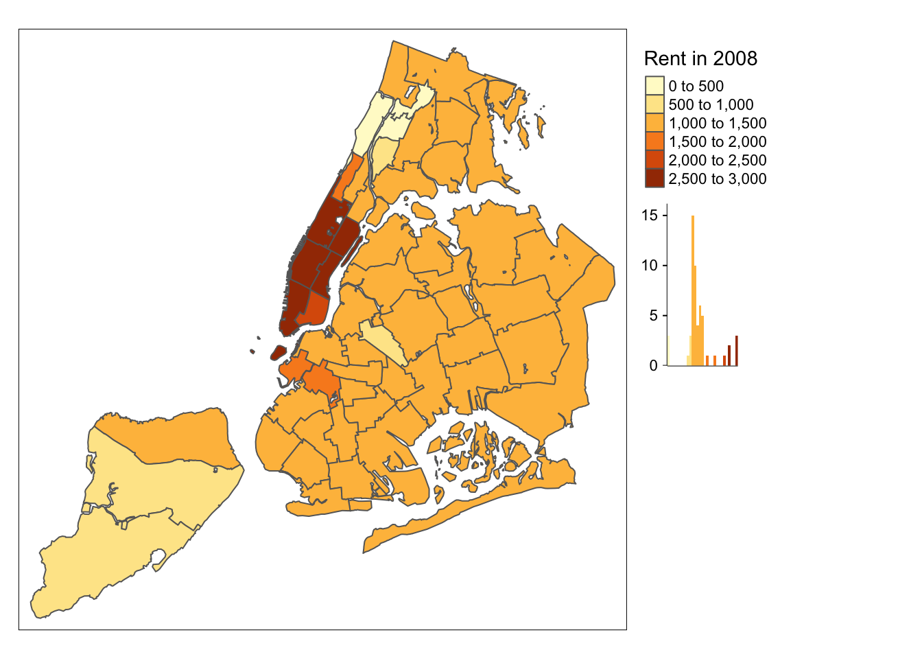
Title
Another functionality of the tm_layout function is to set a title for the map, and specify its position, size, etc. For example, we can set the title, the title.size and the title.position as in the example below (for details, see the tm_layout documentation). We made the font size a bit smaller (0.8) in order not to overwhelm the map, and positioned it in the bottom right-hand corner.
tm_shape(nyc.bound) +
  tm_fill("rent2008",title="Rent in 2008")  +
  tm_borders() +
  tm_layout(title = "Rent 2008 NYC Sub-Boroughs", title.size = 0.8, title.position = c("right","bottom"))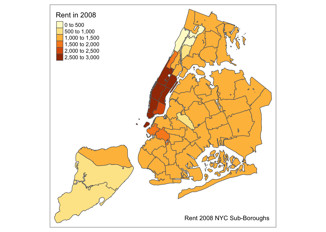
To have a title appear on top (or on the bottom) of the map, rather than inside (the default), we need to set the main.title argument of the tm_layout function, with the associated main.title.position, as illustrated below (with title.size set to 1.5 to have a larger font).
tm_shape(nyc.bound) +
  tm_fill("rent2008",title="Rent in 2008")  +
  tm_borders() +
  tm_layout(main.title = "Rent 2008 NYC Sub-Boroughs", title.size = 1.5,main.title.position="center")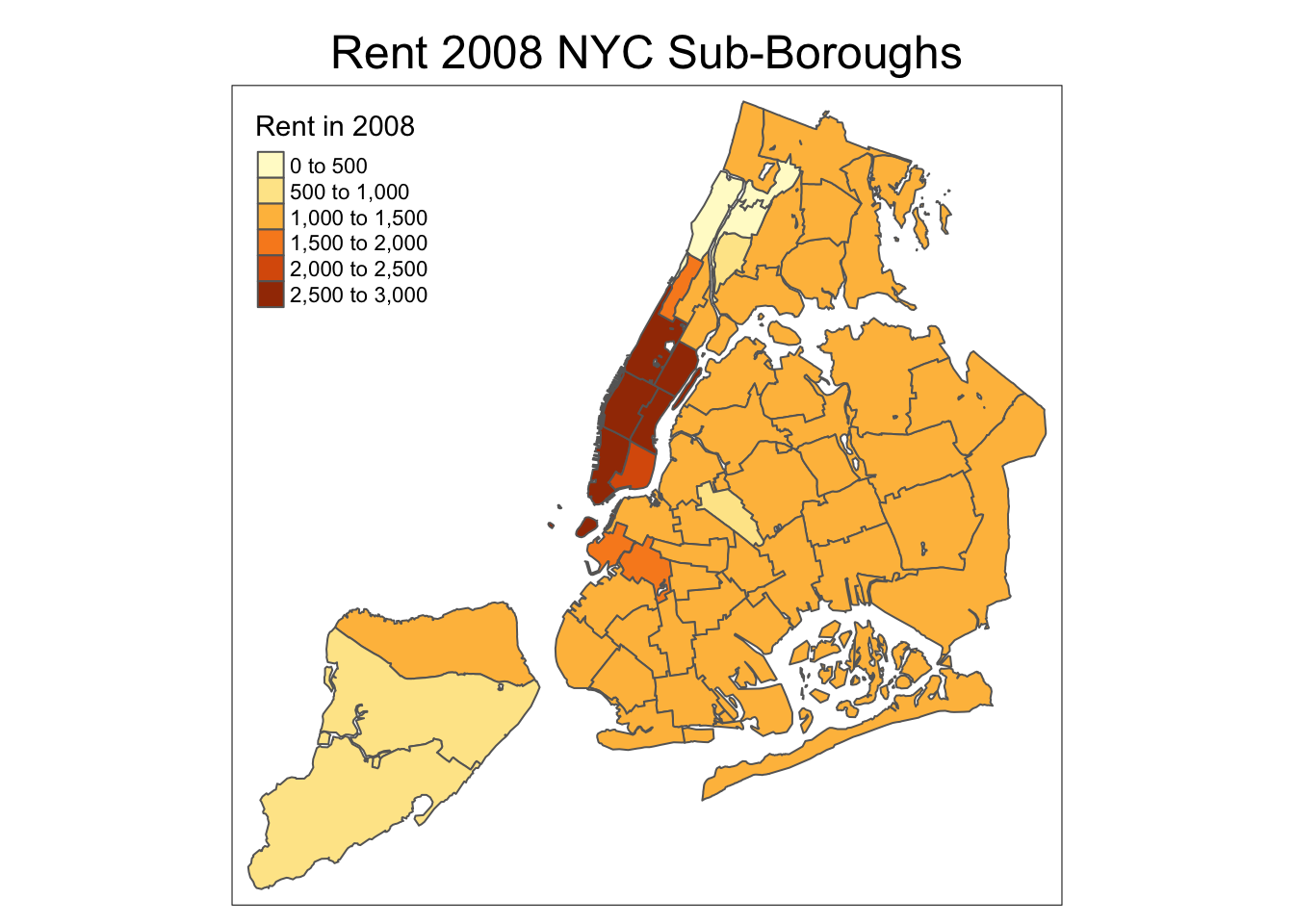
Border options
So far, we have not specified any arguments to the tm_borders function. Common options are the color for the border lines (col), their thickness (lwd) and the type of line (lty). The line type is a base R functionality and can be set by specifying a string (such as “solid”, “dashed”, “dotted”, etc.), or the internal code (e.g., 1 for solid, 2 for dashed, 3 for dotted). To illustrate this, we set the borders to blue, with a line width of 2.0 and use a dotted line.
tm_shape(nyc.bound) +
  tm_fill("rent2008",title="Rent in 2008")  +
  tm_borders(col="blue",lwd=2,lty=3)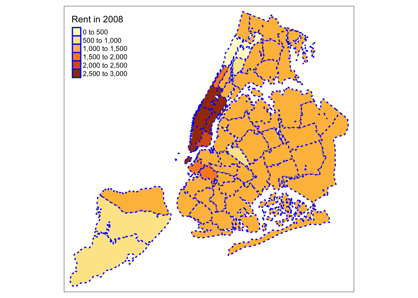
Interactive base map
The default mode in tmap is plot, i.e., the standard plotting environment in R to draw a map on the screen or to a device (e.g., a pdf file). There is also an interactive mode, which builds upon leaflet to add a basemap and interact with the map through zooming and identification of individual observations. The interactive mode is referred to as view. We switch between modes by means of the tmap_mode command.
tmap_mode("view")## tmap mode set to interactive viewingThere are a number of different ways in which a basemap can be added. The current preferred approach is through the tm_basemap command. This takes two important arguments. One is the name of the server. A number of basemaps are supported (and no doubt, that number will increase over time), but we will illustrate the OpenStreetMap option. A second argument is the degree of transparency, or alpha level. This can also be set for the map itself through tm_fill. In practice, one typically needs to experiment a bit to find the right balance between the information in the choropleth map and the background.
In the example below, we set the alpha level for the main map to 0.7, and for the base layer to 0.5. When we move the pointer over the polygons, their ID value is shown. A click on a location also gives the value for the variable that is being mapped. Zooming and panning are supported as well. In addition, it is possible to stack several layers, but we won’t pursue that here.
tm_shape(nyc.bound) +
  tm_fill("rent2008",title="Rent in 2008",alpha=0.7) +
  tm_borders() +
  tm_basemap(server="OpenStreetMap",alpha=0.5)
Before we proceed, we turn the mode back to plot.
tmap_mode("plot")## tmap mode set to plottingSaving a map as a file
So far, we have only plotted the map to the screen or an interactive widget. In order to save the map as an output, we first assign the result of a series of tmap commands to a variable (an object). We can then save this object by means of the tmap_save function.4
This function takes the map object as the argument tm and the output file name as the argument filename. The default output is a png file. Other formats are obtained by including the proper file extension.
There are many other options in this command, such as specifying the height, width, and dpi. Details can be found in the list of options.
For example, we assign our rudimentary default map to the variable mymap and then save that to the file mymap.png.
mymap <- tm_shape(nyc.bound) +
  tm_fill("kids2000") +
  tm_borders()
tmap_save(tm = mymap, filename = "mymap.png")
## Map saved to /Users/luc/github/spatialanalysis/lab_tutorials/mymap.png## Resolution: 2100 by 1500 pixels## Size: 7 by 5 inches (300 dpi)Shape centers
GeoDa has functionality invoked from a map window to map or save shape centers, i.e., mean centers and centroids. The st_centroid function is part of sf (there is no obvious counterpart to the mean center functionality). It creates a point simple features layer and contains all the variables of the original layer.
nycentroid <- st_centroid(nyc.bound)## Warning in st_centroid.sf(nyc.bound): st_centroid assumes attributes are
## constant over geometries of xsummary(nycentroid)## bor_subb name code
## Min. :101.0 Astoria : 1 Min. :101.0
## 1st Qu.:204.5 Bay Ridge : 1 1st Qu.:204.5
## Median :218.0 Bayside / Little Neck: 1 Median :218.0
## Mean :274.4 Bedford Stuyvesant : 1 Mean :274.4
## 3rd Qu.:403.5 Bellerose / Rosedale : 1 3rd Qu.:403.5
## Max. :503.0 Bensonhurst : 1 Max. :503.0
## (Other) :49
## subborough forhis06 forhis07 forhis08
## Astoria : 1 Min. :10.70 Min. :10.37 Min. : 9.689
## Bay Ridge : 1 1st Qu.:29.61 1st Qu.:28.92 1st Qu.:28.182
## Bayside/Little Neck: 1 Median :39.72 Median :39.21 Median :39.567
## Bedford Stuyvesant : 1 Mean :39.22 Mean :38.33 Mean :37.764
## Bensonhurst : 1 3rd Qu.:44.61 3rd Qu.:45.30 3rd Qu.:45.496
## Borough Park : 1 Max. :69.52 Max. :69.40 Max. :69.341
## (Other) :49
## forhis09 forwh06 forwh07 forwh08
## Min. :14.66 Min. : 0.00 Min. : 0.00 Min. : 0.00
## 1st Qu.:28.28 1st Qu.:14.26 1st Qu.:14.56 1st Qu.:14.30
## Median :35.99 Median :21.18 Median :21.10 Median :21.39
## Mean :37.46 Mean :24.36 Mean :23.54 Mean :22.67
## 3rd Qu.:45.14 3rd Qu.:31.53 3rd Qu.:29.78 3rd Qu.:31.38
## Max. :69.16 Max. :60.36 Max. :59.64 Max. :59.11
##
## forwh09 hhsiz1990 hhsiz00 hhsiz02
## Min. : 0.00 Min. :1.560 Min. :1.574 Min. :1.532
## 1st Qu.:13.57 1st Qu.:2.428 1st Qu.:2.445 1st Qu.:2.234
## Median :19.69 Median :2.716 Median :2.718 Median :2.568
## Mean :21.98 Mean :2.635 Mean :2.639 Mean :2.505
## 3rd Qu.:27.98 3rd Qu.:2.937 3rd Qu.:2.929 3rd Qu.:2.812
## Max. :56.89 Max. :3.376 Max. :3.202 Max. :3.087
##
## hhsiz05 hhsiz08 kids2000 kids2005
## Min. :1.544 Min. :1.544 Min. : 8.382 Min. : 8.708
## 1st Qu.:2.271 1st Qu.:2.203 1st Qu.:30.301 1st Qu.:27.871
## Median :2.567 Median :2.488 Median :38.228 Median :35.763
## Mean :2.471 Mean :2.424 Mean :36.040 Mean :34.353
## 3rd Qu.:2.682 3rd Qu.:2.665 3rd Qu.:42.773 3rd Qu.:42.152
## Max. :3.106 Max. :3.222 Max. :55.367 Max. :50.872
##
## kids2006 kids2007 kids2008 kids2009
## Min. : 8.683 Min. : 8.067 Min. : 8.004 Min. : 0.00
## 1st Qu.:26.215 1st Qu.:27.366 1st Qu.:27.843 1st Qu.:26.69
## Median :36.524 Median :35.414 Median :33.883 Median :33.53
## Mean :33.847 Mean :33.801 Mean :33.212 Mean :32.07
## 3rd Qu.:41.174 3rd Qu.:40.290 3rd Qu.:40.610 3rd Qu.:39.68
## Max. :51.911 Max. :51.502 Max. :49.716 Max. :48.13
##
## rent2002 rent2005 rent2008 rentpct02
## Min. : 0.0 Min. : 0.0 Min. : 0 Min. : 0.00
## 1st Qu.: 750.0 1st Qu.: 897.5 1st Qu.:1000 1st Qu.:13.27
## Median : 800.0 Median : 990.0 Median :1100 Median :21.11
## Mean : 944.4 Mean :1045.9 Mean :1257 Mean :22.01
## 3rd Qu.:1000.0 3rd Qu.:1100.0 3rd Qu.:1362 3rd Qu.:29.49
## Max. :2500.0 Max. :2500.0 Max. :2900 Max. :43.38
##
## rentpct05 rentpct08 pubast90 pubast00
## Min. : 0.00 Min. : 0.00 Min. :23.89 Min. : 0.8981
## 1st Qu.:13.04 1st Qu.:15.48 1st Qu.:62.38 1st Qu.: 3.3860
## Median :22.59 Median :23.70 Median :75.44 Median : 6.8781
## Mean :22.08 Mean :23.41 Mean :71.53 Mean : 8.4372
## 3rd Qu.:30.51 3rd Qu.:31.50 3rd Qu.:84.59 3rd Qu.:11.5369
## Max. :40.88 Max. :47.38 Max. :96.65 Max. :23.4318
##
## yrhom02 yrhom05 yrhom08 geometry
## Min. : 8.216 Min. : 8.583 Min. : 8.278 POINT :55
## 1st Qu.:11.264 1st Qu.:11.268 1st Qu.:10.846 epsg:NA : 0
## Median :12.391 Median :12.217 Median :12.274 +proj=lcc ...: 0
## Mean :12.251 Mean :12.273 Mean :12.058
## 3rd Qu.:13.160 3rd Qu.:13.288 3rd Qu.:13.001
## Max. :16.124 Max. :16.627 Max. :15.425
## We can now exploit the layered logic of tm_map to first draw the outlines of the sub-boroughs using tm_borders, followed by tm_dots for the point layer. The tm_dots command is a specialized version of tm_symbols, which has a very large set of options.
We use two simple options: size=0.2 to make the points a little larger than the default, and col to set the color to red.
tm_shape(nyc.bound) +
  tm_borders() +
  tm_shape(nycentroid) +
  tm_dots(size=0.2,col="red")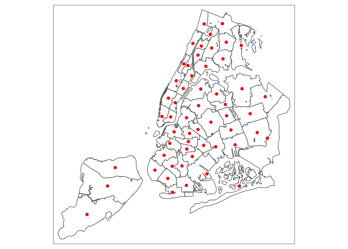
A close examination of the map reveals that the centroid locations can be problematic for non-convex polygons.
We can save the centroid point layer as a shape file by means of the st_write function we saw earlier (in the spatial data handling notes).
st_write(nycentroid, "nyc_centroids", driver = "ESRI Shapefile")## Writing layer `nyc_centroids' to data source `nyc_centroids' using driver `ESRI Shapefile'
## features: 55
## fields: 34
## geometry type: PointCommon Map Classifications
The statistical aspects of a choropleth map are expressed through the map classification that is used to convert observations for a continuous variable into a small number of bins, similar to what is the case for a histogram. Different classifications reveal different aspects of the spatial distribution of the variable.
In tmap, the classification is selected by means of the style option in tm_fill. So far, we have used the default, which is set to pretty. The latter is a base R function to compute a sequence of roughly equally spaced values. Note that the number of intervals that results is not necessariy equal to n (the preferred number of classes), which can seem confusing at first.5
There are many classification types available in tmap, which each correspond to either a base R function, or to a custom expression contained in the classIntervals functionality.
In this section, we review the quantile map, natural breaks map, and equal intervals map, and also illustrate how to set custom breaks with their own labels. For a detailed discussion of the methodological issues associated with these classifications, we refer to the GeoDa Workbook. We continue to use the same example for rent2008.
Quantile map
A quantile map is obtained by setting style=“quantile” in the tm_fill command. The number of categories is taken from the n argument, which has a default value of 5. So, for example, using this default will yield a quintile map with five categories (we specify the type of map in the title through tm_layout).
tm_shape(nyc.bound) +
  tm_fill("rent2008",title="Rent in 2008",style="quantile")  +
  tm_borders() +
  tm_layout(title = "Quintile Map", title.position = c("right","bottom"))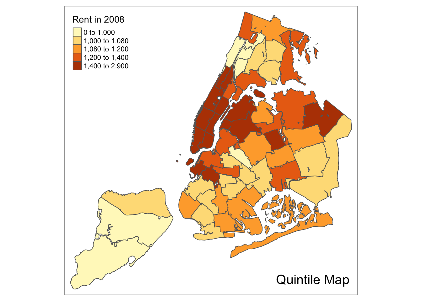
We follow the example in the GeoDa Workbook and illustrate a quartile map. This is created by specifying n=4, for four categories with style=“quantile”. The rest of the commands are the same as before.
tm_shape(nyc.bound) +
  tm_fill("rent2008",title="Rent in 2008",n=4,style="quantile")  +
  tm_borders() +
  tm_layout(title = "Quartile Map", title.position = c("right","bottom"))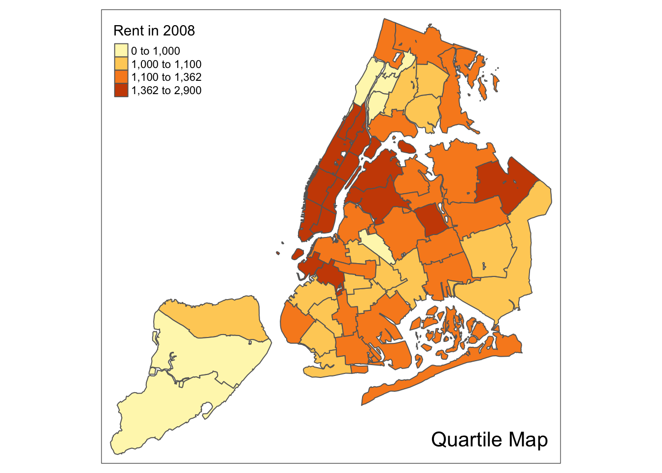
Natural breaks map
A natural breaks map is obtained by specifying the style = “jenks” in tm_fill. All the other options are as before. Again, we illustrate this for four categories, with n=4.
tm_shape(nyc.bound) +
  tm_fill("rent2008",title="Rent in 2008",n=4,style="jenks")  +
  tm_borders() +
  tm_layout(title = "Natural Breaks Map", title.position = c("right","bottom"))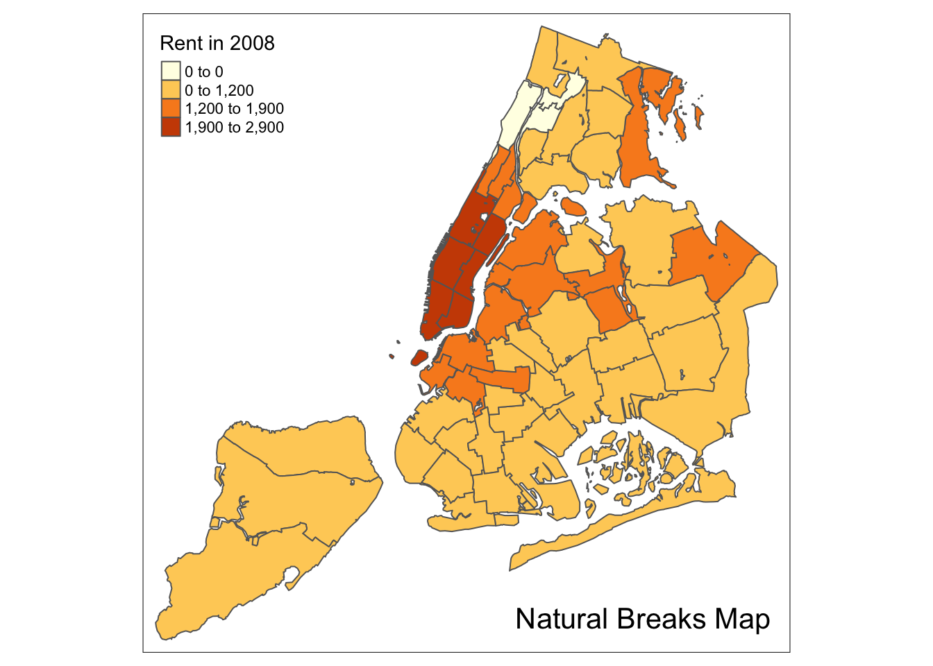
Equal intervals map
An equal intervals map for four categories is obtained by setting n=4, and style=“equal”. The resulting map replicates the result in GeoDa.
tm_shape(nyc.bound) +
  tm_fill("rent2008",title="Rent in 2008",n=4,style="equal")  +
  tm_borders() +
  tm_layout(title = "Equal Intervals Map", title.position = c("right","bottom"))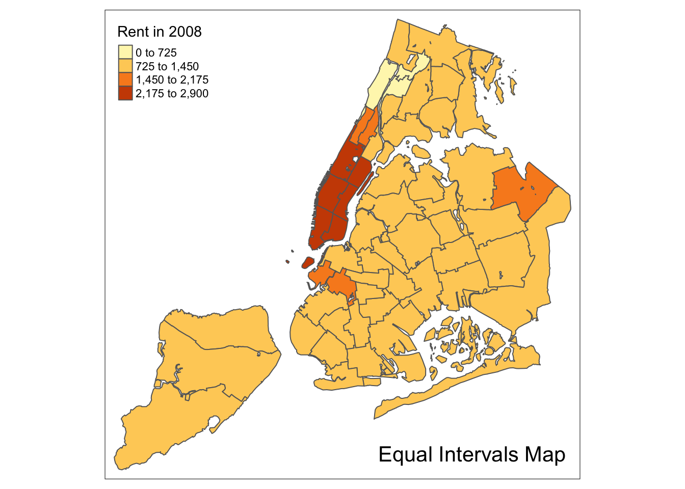
Custom breaks
For all the built-in styles, the category breaks are computed internally. In order to override these defaults, the breakpoints can be set explicitly by means of the breaks argument to the tm_fill function. To illustrate this, we mimic the example in the GeoDa Workbook, which uses the variable kids2000. The classification results in six categories. Unlike what is the case in the GeoDa Category Editor, in tmap the breaks include a minimum and maximum (in GeoDa, only the break points themselves need to be specified). As a result, in order to end up with n categories, n+1 elements must be specified in the breaks option (the values must be in increasing order).
It is always good practice to get some descriptive statistics on the variable before setting the break points. For kids2000, a summary command yields the following results.
summary(nyc.bound$kids2000)## Min. 1st Qu. Median Mean 3rd Qu. Max.
## 8.382 30.301 38.228 36.040 42.773 55.367Following the example in the GeoDa workbook, we set break points at 20, 30, 40, 45, and 50. In addition, we also need to include a minimum and maximum, which we set at 0 and 65. Our breaks vector is thus c(0,20,30,40,45,50,60).
We also use the same color palette as in the GeoDa Workbook. This is a sequential scale, referred to as “YlOrBr” in ColorBrewer.
The resulting map is identical to the one obtained with GeoDa.
tm_shape(nyc.bound) +
  tm_fill("kids2000",title="Percentage Kids",breaks=c(0,20,30,40,45,50,60),palette="YlOrBr")  +
  tm_borders() +
  tm_layout(title = "Custom Breaks Map", title.position = c("right","bottom"))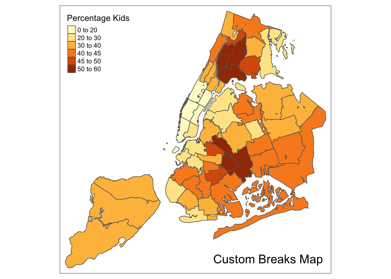
Extreme Value Maps
In addition to the common map classifications, GeoDa also supports three types of extreme value maps: a percentile map, box map, and standard deviation map. For details on the rationale and methodology behind these maps, we refer to the GeoDa Workbook.
Of the three extreme value maps, only the standard deviation map is included as a style in tmap. To create the other two, we will need to use the custom breaks functionality. Ideally, we should create an additional style, but that’s beyond the scope of these notes.
The three extreme value maps in GeoDa share the same color palette. This is a diverging scale with 6 categories, corresponding to the ColorBrewer “RdBu” scheme. We can illustrate the associated colors with a display.brewer.pal command.
display.brewer.pal(6,"RdBu")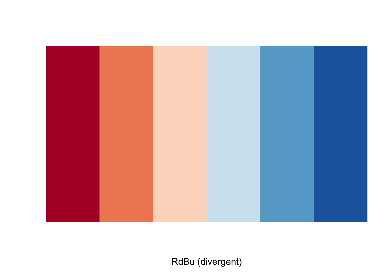
This seems OK at first sight, but the ranking is the opposite of the one used in GeoDa. Therefore, to reverse the order, we will need to preface the name with a “-” in the palette specification.
Percentile map
The percentile map is a special type of quantile map with six specific categories: 0-1%,1-10%, 10-50%,50-90%,90-99%, and 99-100%. We can obtain the corresponding breakpoints by means of the base R quantile command, passing an explicit vector of cumulative probabilities as c(0,.01,.1,.5,.9,.99,1). Note that the begin and endpoint need to be included, as we already pointed out in the discussion of the generic custom break points.
A percentile map is then created by passing the resulting break points to tm_fill. In addition, we can also pass labels for the new categories, using the labels option, for example, as labels = c("< 1%", "1% - %10", "10% - 50%", "50% - 90%","90% - 99%", "> 99%").
Extracting a variable from an sf data frame
There is one catch, however. When variables are extracted from an sf dataframe, the geometry is extracted as well. For mapping and spatial manipulation, this is the expected behavior, but many base R functions cannot deal with the geometry. Specifically, the quantile function gives an error.
For example, this is illustrated when we extract the variable rent2008 and then apply the quantile function.
percent <- c(0,.01,.1,.5,.9,.99,1)
var <- nyc.bound["rent2008"]
quantile(var,percent)
## Error in as.data.frame.default(x[[i]], optional = TRUE, stringsAsFactors = stringsAsFactors): cannot coerce class 'c("XY", "MULTIPOLYGON", "sfg")' to a data.frameWe remove the geometry by means of the st_set_geometry(NULL) operation in sf, but it still doesn’t work.
var <- nyc.bound["rent2008"] %>% st_set_geometry(NULL)
quantile(var,percent)
## Error in `[.data.frame`(x, order(x, na.last = na.last, decreasing = decreasing)): undefined columns selectedAs it happens, the selection of the variable returns a data frame, not a vector, and the quantile function doesn’t know which column to use. We make that explicit by taking the first column (and all rows), as [,1]. Now, it works.
var <- nyc.bound["rent2008"] %>% st_set_geometry(NULL)
quantile(var[,1],percent)
## 0% 1% 10% 50% 90% 99% 100%
## 0 0 950 1100 2140 2873 2900Since we will have to carry out this kind of transformation any time we want to carry out some computation on a variable, we create a simple helper function to extract the variable vname from the simple features data frame df. We have added one extra feature, i.e., we remove the name of the vector by means of unname.
get.var <- function(vname,df) {
  # function to extract a variable as a vector out of an sf data frame
  # arguments:
  #    vname: variable name (as character, in quotes)
  #    df: name of sf data frame
  # returns:
  #    v: vector with values (without a column name)
  v <- df[vname] %>% st_set_geometry(NULL)
  v <- unname(v[,1])
  return(v)
}
A percentile map function
To create a percentile map for the variable rent2008 from scratch, we proceed in four steps. First, we set the cumulative percentages to compute the quantiles, in the vector percent. Second, we extract the variable as a vector using our function get.var. Next, we compute the breaks with the quantile function. Finally, we create the map using tm_fill with the breaks and labels option, and the palette set to “-RdBu” (to reverse the default order of the colors).
percent <- c(0,.01,.1,.5,.9,.99,1)
var <- get.var("rent2008",nyc.bound)
bperc <- quantile(var,percent)
tm_shape(nyc.bound) +
  tm_fill("rent2008",title="Rent in 2008",breaks=bperc,palette="-RdBu",
          labels=c("< 1%", "1% - %10", "10% - 50%", "50% - 90%","90% - 99%", "> 99%"))  +
  tm_borders() +
  tm_layout(title = "Percentile Map", title.position = c("right","bottom"))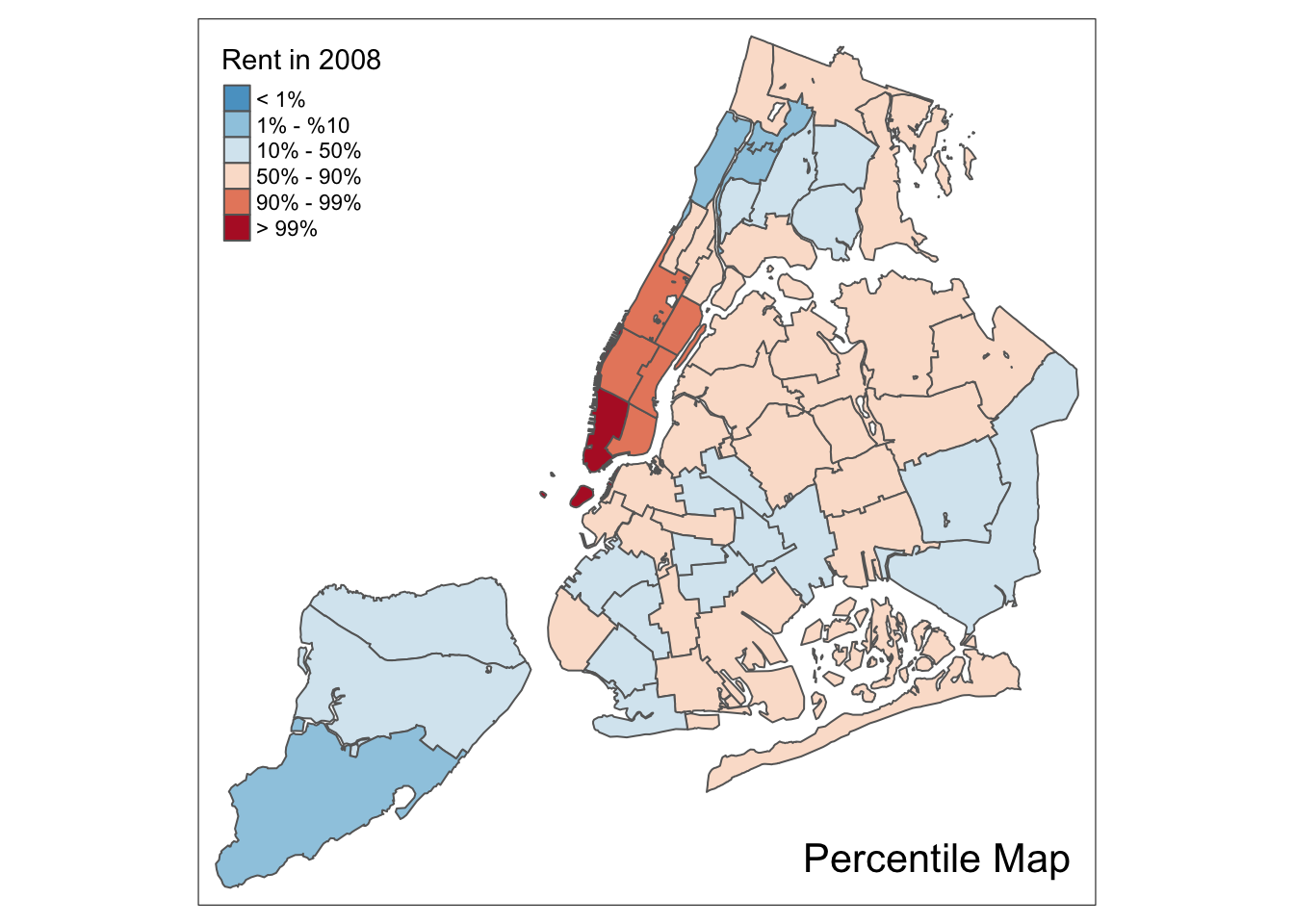
We can summarize this in a simple function. Note that this is just a bare bones implementation. Additional arguments could be passed to customize various features of the map (such as the title, legend positioning, etc.), but we leave that for an exercise. Also, the function assumes (and does not check) that get.var is available. For general use, this should not be assumed.
The minimal arguments we can pass are the variable name (vnam), the data frame (df), a title for the legend (legtitle, set to NA as default, the same default as in tm_fill), and an optional title for the map (mtitle, set to Percentile Map as the default).
percentmap <- function(vnam,df,legtitle=NA,mtitle="Percentile Map"){
  # percentile map
  # arguments:
  #   vnam: variable name (as character, in quotes)
  #   df: simple features polygon layer
  #   legtitle: legend title
  #   mtitle: map title
  # returns:
  #   a tmap-element (plots a map)
  percent <- c(0,.01,.1,.5,.9,.99,1)
  var <- get.var(vnam,df)
  bperc <- quantile(var,percent)
  tm_shape(df) +
     tm_fill(vnam,title=legtitle,breaks=bperc,palette="-RdBu",
          labels=c("< 1%", "1% - %10", "10% - 50%", "50% - 90%","90% - 99%", "> 99%"))  +
  tm_borders() +
  tm_layout(title = mtitle, title.position = c("right","bottom"))
}
We illustrate this for the rent2008 variable, without a legend title.
percentmap("rent2008",nyc.bound)
Box map
To create a box map, we proceed largely along the same lines as for the percentile map, using the custom breaks specification. However, there is a complication. The break points for the box map vary depending on whether lower or upper outliers are present.
In essence, a box map is an augmented quartile map, with an additional lower and upper category. When there are lower outliers, then the starting point for the breaks is the minimum value, and the second break is the lower fence. In contrast, when there are no lower outliers, then the starting point for the breaks will be the lower fence, and the second break is the minimum value (there will be no observations that fall in the interval between the lower fence and the minimum value).
The same complication occurs at the upper end of the distribution. When there are upper outliers, then the last value for the breaks is the maximum value, and the next to last value is the upper fence. In contrast, when there are no upper outliers, then the last value is the upper fence, and the next to last is the maximum. As such, however, this is not satisfactory, because the default operation of the cuts is to have the interval.closure=“left”. This implies that the observation with the maximum value (the break point for the last category) will always be assigned to the outlier category when there are in fact no outliers. Similarly, the observation with the minimum value (the break point for the second category) will be assigned to the first group.
We therefore create a small function to deal with these complications and compute the break points for a box map. Then we create a function for the box map along the same lines as for the percentile map.
Computing the box map break points
We follow the logic outlined above to create the 7 breakpoints (for the 6 categories) for the box map. We handle the problem with the interval closure by rounding the maximum value such that its observation will always fall in the proper category. We need to distinguish between a minimum and a maximum. For the former, we use the floor function, for the latter, the ceiling function.
Our function boxbreaks returns the break points. It reuses the same calculations that we already exploited to compute the fences for the box plot. It takes a vector of observations and optionally a value for the multiplier as arguments (the default multiplier is 1.5). The function first gets the quartile values from the quantile function (the default is to compute quartiles, so we do not have to pass cumulative probabilities). Next, we calculate the upper and lower fence for the given multiplier value.
The break points vector (bb) is initialized as a zero vector with 7 values (one more than the number of categories). The middle three values (3 to 5) will correspond to the first quartile, median, and third quartile. The first two values are allocated depending on whether there are lower outliers, and the same for the last two values.
boxbreaks <- function(v,mult=1.5) {
  # break points for box map
  # arguments:
  #   v: vector with observations
  #   mult: multiplier for IQR (default 1.5)
  # returns:
  #   bb: vector with 7 break points
  # compute quartile and fences
  qv <- unname(quantile(v))
  iqr <- qv[4] - qv[2]
  upfence <- qv[4] + mult * iqr
  lofence <- qv[2] - mult * iqr
  # initialize break points vector
  bb <- vector(mode="numeric",length=7)
  # logic for lower and upper fences
  if (lofence < qv[1]) {  # no lower outliers
    bb[1] <- lofence
    bb[2] <- floor(qv[1])
  } else {
    bb[2] <- lofence
    bb[1] <- qv[1]
  }
  if (upfence > qv[5]) { # no upper outliers
    bb[7] <- upfence
    bb[6] <- ceiling(qv[5])
  } else {
    bb[6] <- upfence
    bb[7] <- qv[5]
  }
  bb[3:5] <- qv[2:4]
  return(bb)
}
We illustrate this for rent2008, taking advantage of our get.var function.
var <- get.var("rent2008",nyc.bound)
boxbreaks(var)
## [1] 0.00 456.25 1000.00 1100.00 1362.50 1906.25 2900.00In our example, there are both lower and upper outliers. As a result, the first and last values in the vector are, respectively, the minimum and maximum, and positions 2 and 6 are taken by the lower and upper fence.
A box map function
Our function boxmap is designed along the same lines as the percentile map. It assumes that both get.var and boxbreaks are available. Again, the minimal arguments we can pass are the variable name (vnam), the data frame (df), a title for the legend (legtitle, set to NA as default, the same default as in tm_fill), and an optional title for the map (mtitle, set to Percentile Map as the default). In addition, we also need to pass a value for the multiplier (mult, needed by boxbreaks).
boxmap <- function(vnam,df,legtitle=NA,mtitle="Box Map",mult=1.5){
  # box map
  # arguments:
  #   vnam: variable name (as character, in quotes)
  #   df: simple features polygon layer
  #   legtitle: legend title
  #   mtitle: map title
  #   mult: multiplier for IQR
  # returns:
  #   a tmap-element (plots a map)
  var <- get.var(vnam,df)
  bb <- boxbreaks(var)
  tm_shape(df) +
     tm_fill(vnam,title=legtitle,breaks=bb,palette="-RdBu",
          labels = c("lower outlier", "< 25%", "25% - 50%", "50% - 75%","> 75%", "upper outlier"))  +
  tm_borders() +
  tm_layout(title = mtitle, title.position = c("right","bottom"))
}
Illustrated for the rent2008 variable:
boxmap("rent2008",nyc.bound)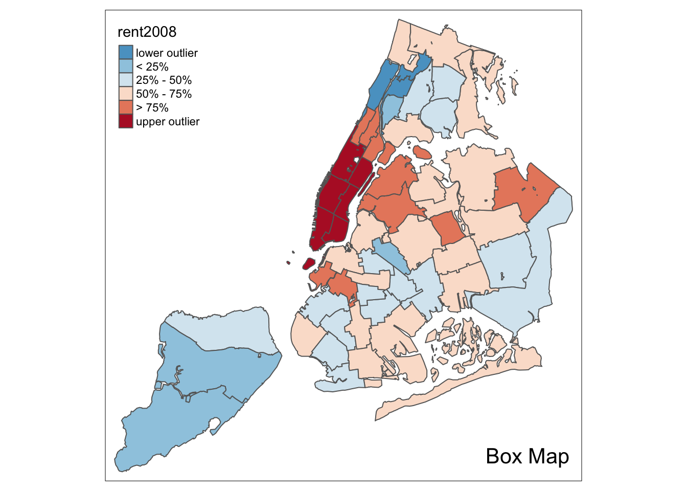
Standard deviation map
A standard deviation map is included in tmap as style=“sd”. We follow the GeoDa Workbook and return to the rent2008 variable for our examples. Apart from setting the style, we also specify the palette=“-RdBu”. This yields the same map as GeoDa.
tm_shape(nyc.bound) +
  tm_fill("rent2008",title="Rent in 2008",style="sd",palette="-RdBu")  +
  tm_borders() +
  tm_layout(title = "Standard Deviation Map", title.position = c("right","bottom"))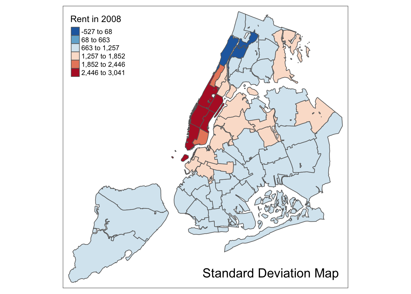
Mapping Categorical Variables
In the GeoDa Workbook, the mapping of categorical variables is illustrated by extracting the classifications from a map as integer values. There doesn’t seem to be an obvious way to do this for a tmap element. Instead, we will resort to the base R function cut to create integer values for a classification. We will then turn these into factors to be able to use the style=“cat” option in tm_fill. Note that it is important to have the variable as a factor. When integer values are used as such, the resulting map follows a standard sequential classification.
Creating categories
We use the same example variables as in the GeoDa Workbook and create box map categories for kids2000 and pubast00. We first extract the variable, using our get.var function.
var <- get.var("kids2000",nyc.bound)Next, we construct a vector with the boxmap breakpoints using our boxbreaks function.
vbreaks <- boxbreaks(var)
vbreaks
## [1] 8.38150 11.59360 30.30115 38.22780 42.77285 56.00000 61.48040We verify the treatment of lower and upper fences by comparing the result to a summary.
summary(var)## Min. 1st Qu. Median Mean 3rd Qu. Max.
## 8.382 30.301 38.228 36.040 42.773 55.367We observe that the first value in the breaks vector is the minimum, indicating lower outliers. However, the last value is larger than the maximum, indicating the lack of upper outliers. Consequently, our integer codes will not include the value 6.
We use the boxmap breaks to create a classification by means of the cut function. We pass the vector of observations and the vector of breaks and then specify some important options. The default in cut is to create labels for the categories as strings that show the lower and upper bound. Instead, we want to have a numeric code, so we set the option labels=FALSE (the opposite of the default). Also, we want to make sure that the mininum value is included if it is the lowest value (the default is that it would not be) by setting include.lowest=TRUE. The result is a vector of integer codes. Since we only have 55 observations, we can list the result (note the absence of a code of 6).
vcat <- cut(var,breaks=vbreaks,labels=FALSE,include.lowest=TRUE)
vcat
## [1] 4 3 4 2 2 4 4 3 2 3 3 5 4 3 5 4 4 1 2 1 1 2 2 3 3 3 4 5 5 5 5 5 3 5 2
## [36] 3 4 3 5 5 2 2 3 5 5 5 5 4 4 2 4 4 3 3 2Finally, we need to add the new variable as a factor to the simple features layer, using the standard $ notation. We call the new variable kidscat, as in the GeoDa Workbook. We could (and should) turn this whole operation into a function, but we leave that as an exercise for now.
nyc.bound$kidscat <- as.factor(vcat)Unique value map
We are now in a position to create a unique value map for the new variable kidscat. All the options are as before, except that style=“cat” and we set palette=“Paired” to replicate the map in GeoDa.
tm_shape(nyc.bound) +
  tm_fill("kidscat",style="cat",palette="Paired")  +
  tm_borders() +
  tm_layout(title = "Unique Value Map", title.position = c("right","bottom"))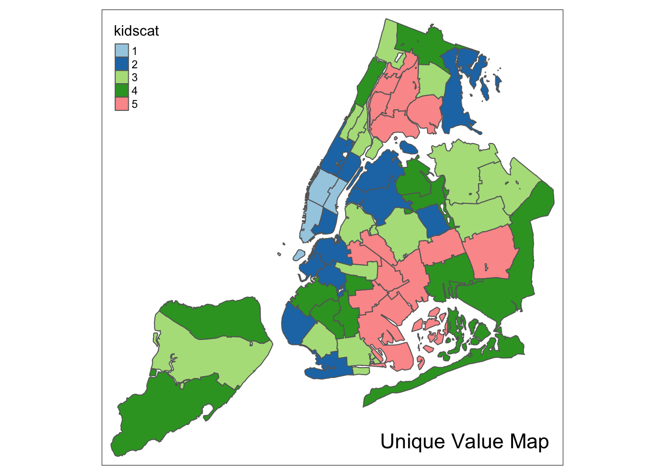
Co-location map
A special case of a map for categorical variables is a so-called co-location map, implemented in GeoDa. This map shows the values for those locations where two categorical variables take on the same value (it is up to the user to make sure the values make sense). Further details are given in the GeoDa Workbook.
To replicate a co-location map in R takes a little bit of work. First we need to identify the locations that match. Then, in order to make a map that makes sense, we need to make sure we pick the right colors from the color palette.
We follow the example in the GeoDa Workbook and create a co-location map for the box map categories for kids2000 and pubast00. We already created the former, as the new variable kidscat. We still need to create a categorical variable for the latter. We proceed in the same way as before to add the variable asstcat to the nyc.bound layer.
var2 <- get.var("pubast00",nyc.bound)
vb2 <- boxbreaks(var2)
vcat2 <- cut(var2,breaks=vb2,labels=FALSE,include.lowest=TRUE)
nyc.bound$asstcat <- as.factor(vcat2)
A unique value map illustrates the spatial distribution of the categories.
tm_shape(nyc.bound) +
  tm_fill("asstcat",style="cat",palette="Paired")  +
  tm_borders() +
  tm_layout(title = "Unique Value Map", title.position = c("right","bottom"))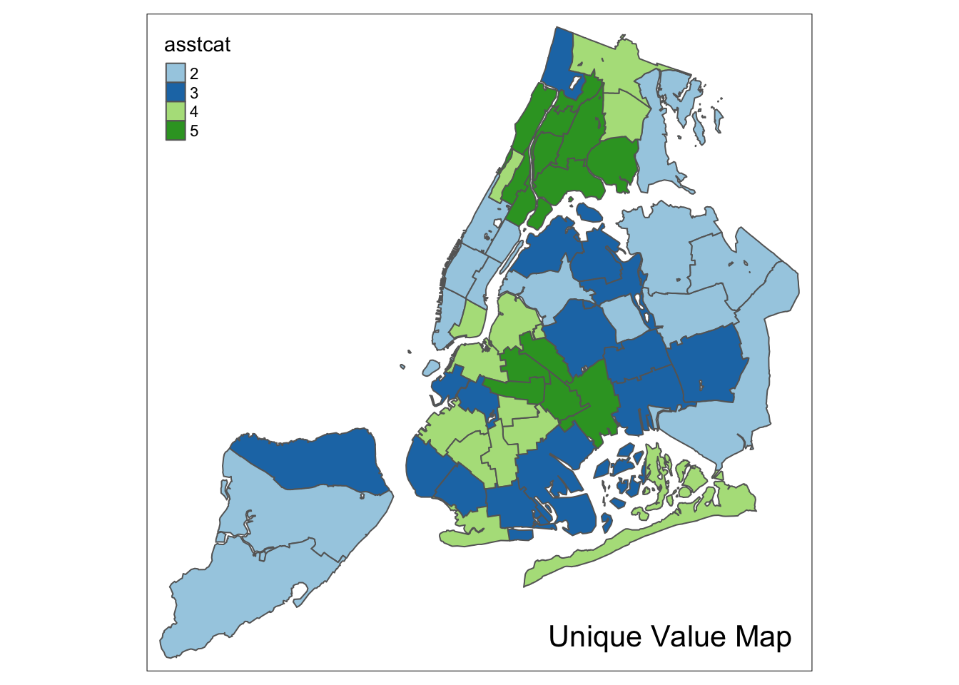
Identifying the matching locations
We find the positions of the matching locations by checking the equality between the variables kidscat and asstcat (note that we need to specify the data frame, using the $ notation to select the variable). Since there is no guarantee that the two variables have the same number of categories (in fact, kidscat has categories 1-5, whereas asstcat has 2-5), a direct comparison of the factors might fail. Therefore, we first turn the factors into numeric values, and then do the comparison. In order to make sure that the resulting integers are the correct categories, we must first convert the factors into strings, using as.character. For example, since our second variable starts at level 2, a simple as.numeric will turn that into 1 (since it is the first level). Finally, we use the which command to find the positions of the observations where the condition is TRUE. There are 25 such locations (out of 55).
v1 <- as.numeric(as.character(nyc.bound$kidscat))
v2 <- as.numeric(as.character(nyc.bound$asstcat))
ch <- v1 == v2
locmatch <- which(ch == TRUE)
locmatch
## [1] 5 8 9 17 22 23 28 29 30 31 32 33 34 35 37 39 40 44 45 48 49 51 52
## [24] 53 54length(locmatch)## [1] 25Since the two variables use the same coding scheme, and the matching locations have the same value, we can use either one to extract a categorical value for the unique value map. We start by initializing a vector of zeros equal in length to the number of observations. We will use a code of 0 for those locations without a match. We next set the vector locations with matching values (the indices contained in locmatch) to their corresponding values in kidscat. Finally, we add the new vector to the simple features layer as a factor.
matchcat <- vector(mode="numeric",length=length(nyc.bound$kidscat))
matchcat[locmatch] <- nyc.bound$kidscat[locmatch]
nyc.bound$colocate <- as.factor(matchcat)
Customizing the color palette
We continue to follow the GeoDa Workbook example and use the color palette for a box map (since both categorical variables were derived from a box map). This is the “RdBu” color scheme in RColorBrewer. However, as we pointed out before, the color order needs to be reversed. We accomplish this with the rev function. In addition, we need to include a color for the mismatch category, which we have set to 0. We take a shade of white for those locations, more specifically, so-called white smoke, with a HEX code of “#F5F5F5”. We add this value in front of the other codes and print the result as a check.
pal <- rev(brewer.pal(6,"RdBu"))
pal <- c("#F5F5F5",pal)
pal
## [1] "#F5F5F5" "#2166AC" "#67A9CF" "#D1E5F0" "#FDDBC7" "#EF8A62" "#B2182B"If we use the full palette, we get the following result.
tm_shape(nyc.bound) +
  tm_fill("colocate",style="cat",palette=pal)  +
  tm_borders() +
  tm_layout(title = "Co-Location Map", title.position = c("right","bottom"))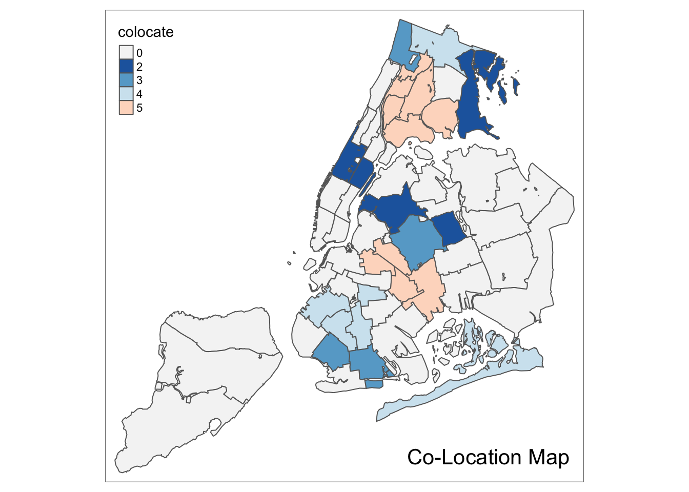
Upon closer examination of the example in the GeoDa Workbook, we see that the color is shifted down for all categories. For example, the color for category 2 should be light blue, not dark blue.
To fix this aspect of the legend, we identify those codes that appear in the colocate vector. This is a bit complicated, since those values are factors. As before, first we need to turn them into strings using as.character, and then we turn this into integers by means of as.numeric. We extract the codes that are present with the unique operator. Next, we need to add 1 to those values to be able to refer to positions in a vector (positions start at 1, not 0). Finally, we extract the proper subset of the color palette.
mcats <- unique(as.numeric(as.character(nyc.bound$colocate)))
mcats <- mcats+1
colpal <- pal[mcats]
We now use this palette in our categorical map to completely replicate the result in GeoDa.
tm_shape(nyc.bound) +
  tm_fill("colocate",style="cat",palette=colpal)  +
  tm_borders() +
  tm_layout(title = "Co-Location Map", title.position = c("right","bottom"))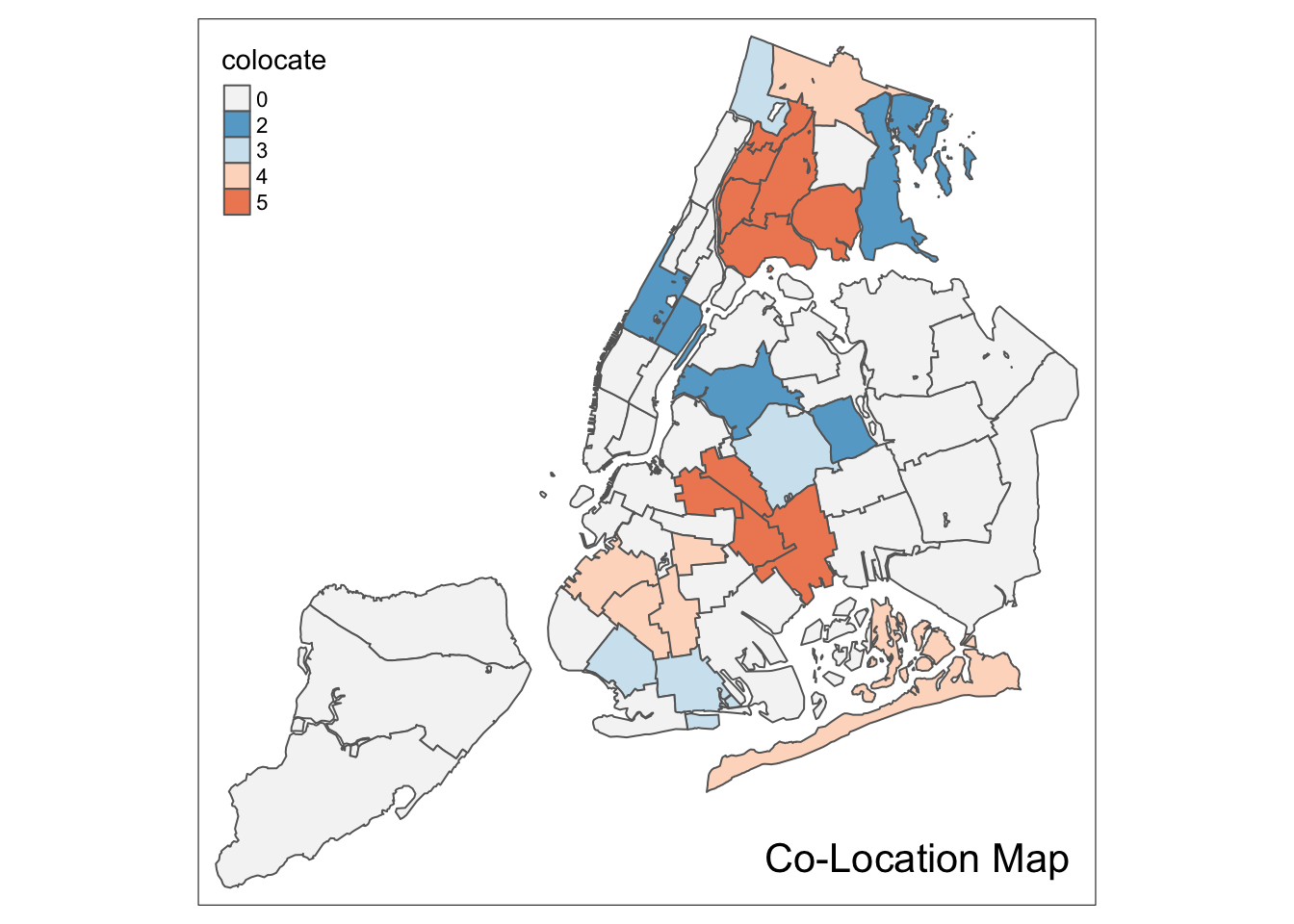
Conditional Map
A conditional map, or facet map, or small multiples, is created by the tm_facets command. This largely follows the logic of the facet_grid command in ggplot that we covered in the EDA notes. An extensive set of options is available to customize the facet maps. An in-depth coverage of all the subtleties is beyond our scope (details can be found on the tm_facets documentation page)
Whereas in GeoDa, the conditions can be based on the original variables, here, we need to first create the conditioning variables as factors. We follow the same procedure as before, but here we use the standard cut function to create the factors. We specify the breaks argument as 2.
We follow the example in the GeoDa Workbook and use hhsiz00 and forhis08 as the conditioning variables. The new factors are cut.hhsiz and cut.forhis. They are added to the nyc.bound layer using the familiar $ operation.
For example, for hhsiz00:
nyc.bound$cut.hhsiz <- cut(nyc.bound$hhsiz00,breaks=2)
nyc.bound$cut.hhsiz
## [1] (2.39,3.2] (2.39,3.2] (2.39,3.2] (2.39,3.2] (2.39,3.2]
## [6] (2.39,3.2] (2.39,3.2] (2.39,3.2] (1.57,2.39] (2.39,3.2]
## [11] (2.39,3.2] (2.39,3.2] (2.39,3.2] (2.39,3.2] (2.39,3.2]
## [16] (2.39,3.2] (2.39,3.2] (1.57,2.39] (1.57,2.39] (1.57,2.39]
## [21] (1.57,2.39] (1.57,2.39] (1.57,2.39] (2.39,3.2] (1.57,2.39]
## [26] (2.39,3.2] (2.39,3.2] (2.39,3.2] (2.39,3.2] (2.39,3.2]
## [31] (2.39,3.2] (2.39,3.2] (1.57,2.39] (2.39,3.2] (1.57,2.39]
## [36] (2.39,3.2] (2.39,3.2] (2.39,3.2] (2.39,3.2] (2.39,3.2]
## [41] (1.57,2.39] (1.57,2.39] (2.39,3.2] (2.39,3.2] (2.39,3.2]
## [46] (2.39,3.2] (2.39,3.2] (2.39,3.2] (2.39,3.2] (1.57,2.39]
## [51] (2.39,3.2] (2.39,3.2] (2.39,3.2] (2.39,3.2] (2.39,3.2]
## Levels: (1.57,2.39] (2.39,3.2]And, similarly for cut.forhis:
nyc.bound$cut.forhis <- cut(nyc.bound$forhis08,breaks=2)
nyc.bound$cut.forhis
## [1] (9.63,39.5] (9.63,39.5] (9.63,39.5] (39.5,69.4] (39.5,69.4]
## [6] (39.5,69.4] (39.5,69.4] (9.63,39.5] (39.5,69.4] (39.5,69.4]
## [11] (39.5,69.4] (39.5,69.4] (39.5,69.4] (39.5,69.4] (39.5,69.4]
## [16] (9.63,39.5] (39.5,69.4] (9.63,39.5] (9.63,39.5] (9.63,39.5]
## [21] (39.5,69.4] (9.63,39.5] (39.5,69.4] (39.5,69.4] (39.5,69.4]
## [26] (9.63,39.5] (39.5,69.4] (9.63,39.5] (9.63,39.5] (39.5,69.4]
## [31] (39.5,69.4] (39.5,69.4] (39.5,69.4] (9.63,39.5] (9.63,39.5]
## [36] (9.63,39.5] (9.63,39.5] (9.63,39.5] (39.5,69.4] (9.63,39.5]
## [41] (9.63,39.5] (9.63,39.5] (9.63,39.5] (9.63,39.5] (9.63,39.5]
## [46] (9.63,39.5] (39.5,69.4] (39.5,69.4] (39.5,69.4] (9.63,39.5]
## [51] (39.5,69.4] (39.5,69.4] (9.63,39.5] (39.5,69.4] (9.63,39.5]
## Levels: (9.63,39.5] (39.5,69.4]The two new factor variables are used as conditioning variables in the by argument of the tm_facets command. The first variable conditions the rows (i.e., is the y-axis), the second variable conditions the columns (i.e., is the x-axis).
We illustrate this with the rent2008 variable, using the default map type. Two important options that affect the look of the conditional map are free.coords and drop.units. The default is that each facet map has its own scaling, focused on the relevant observations. Typically, one wants the same spatial layout in each facet, i.e., all the sub-boroughs in our example. This is ensured by setting free.coords=FALSE. In addition, we want all the spatial units to be shown in each facet (the default is to only show those that match the conditions). This is accomplished by setting drop.units=FALSE. The result is as follows:
tm_shape(nyc.bound) +
  tm_fill("rent2008") +
  tm_borders() +
  tm_facets(by = c("cut.hhsiz", "cut.forhis"),free.coords = FALSE,drop.units=FALSE)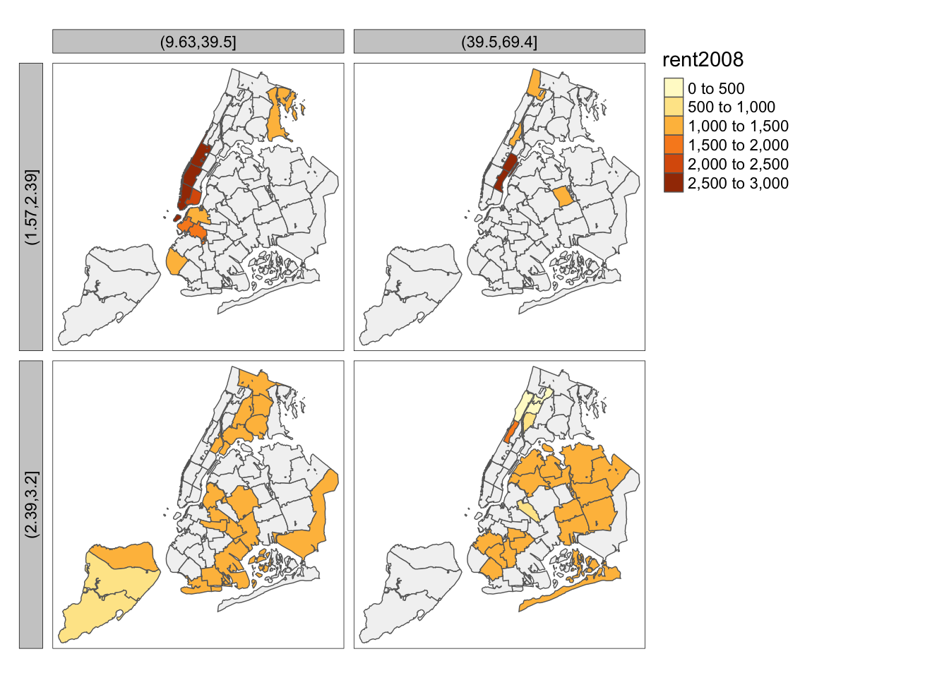
Cartogram
A final map functionality that we replicate from the GeoDa Workbook is the cartogram. GeoDa implements a so-called circular cartogram, where circles represent spatial units and their size is proportional to a specified variable.
In R, a useful implementation of different types of cartograms is included in the package cartogram. Specifically, this supports the circular cartogram, as cartogram_dorling, as well as contiguous and non-contiguous cartograms, as, respectively, cartogram_cont and cartogram_ncont.
The result of these functions is a simple features layer, which can then be mapped by means of the usual tmap commands.
For example, following the GeoDa Workbook, we take the rent2008 variable to construct a circular cartogram. We pass the layer (nyc.bound) and the variable to the cartogram_dorling function. We check that the result is an sf object.
carto.dorling <- cartogram_dorling(nyc.bound,"rent2008")
class(carto.dorling)
## [1] "sf" "data.frame"We can now map the cartogram with the usual tmap command. We just use the default settings here, but, obviously, all the customizations we covered before can be applied to the cartogram as well.
tm_shape(carto.dorling) +
  tm_fill("rent2008") +
  tm_borders()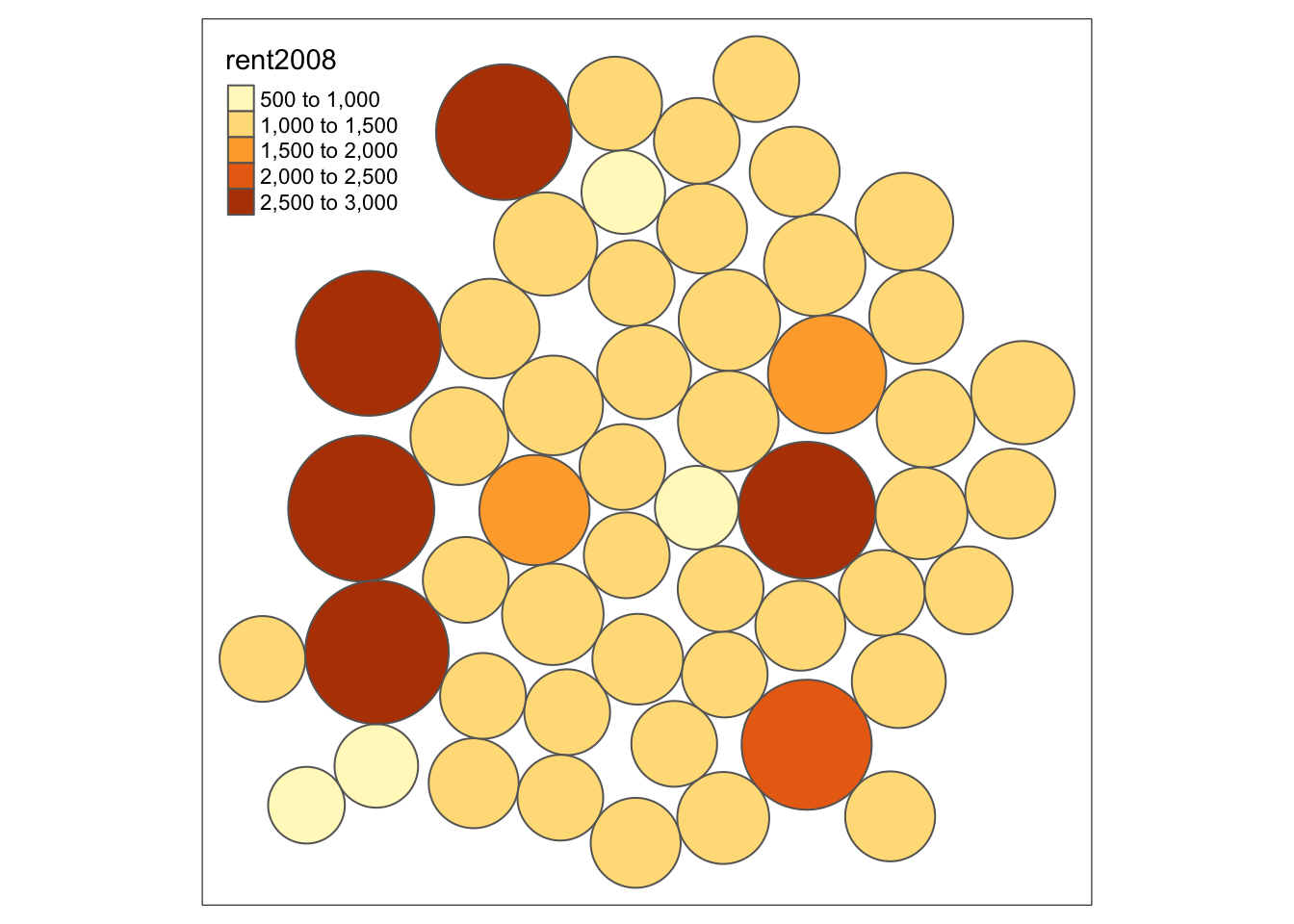
As a bonus, we illustrate the contiguous cartogram, which stretches the boundaries such that the spatial units remain contiguous, but take on an area proportional to the variable of interest (the nonlinear algorithm to compute the new boundaries may take a while). Again, the result can be mapped in the usual way.
carto.cont <- cartogram_cont(nyc.bound,"rent2008")## Mean size error for iteration 1: 2.72610922343519## Mean size error for iteration 2: 2.08034510445717## Mean size error for iteration 3: 1.71497834119152## Mean size error for iteration 4: 1.50262528893196## Mean size error for iteration 5: 1.37280555648014## Mean size error for iteration 6: 1.2936542416361## Mean size error for iteration 7: 1.24063325840557## Mean size error for iteration 8: 1.20489903474226## Mean size error for iteration 9: 1.18019211993724## Mean size error for iteration 10: 1.16217747289101## Mean size error for iteration 11: 1.1475691528168## Mean size error for iteration 12: 1.13532195567302## Mean size error for iteration 13: 1.12488786981234## Mean size error for iteration 14: 1.11564793244753## Mean size error for iteration 15: 1.107286363771tm_shape(carto.cont) +
tm_fill("rent2008") +
tm_borders()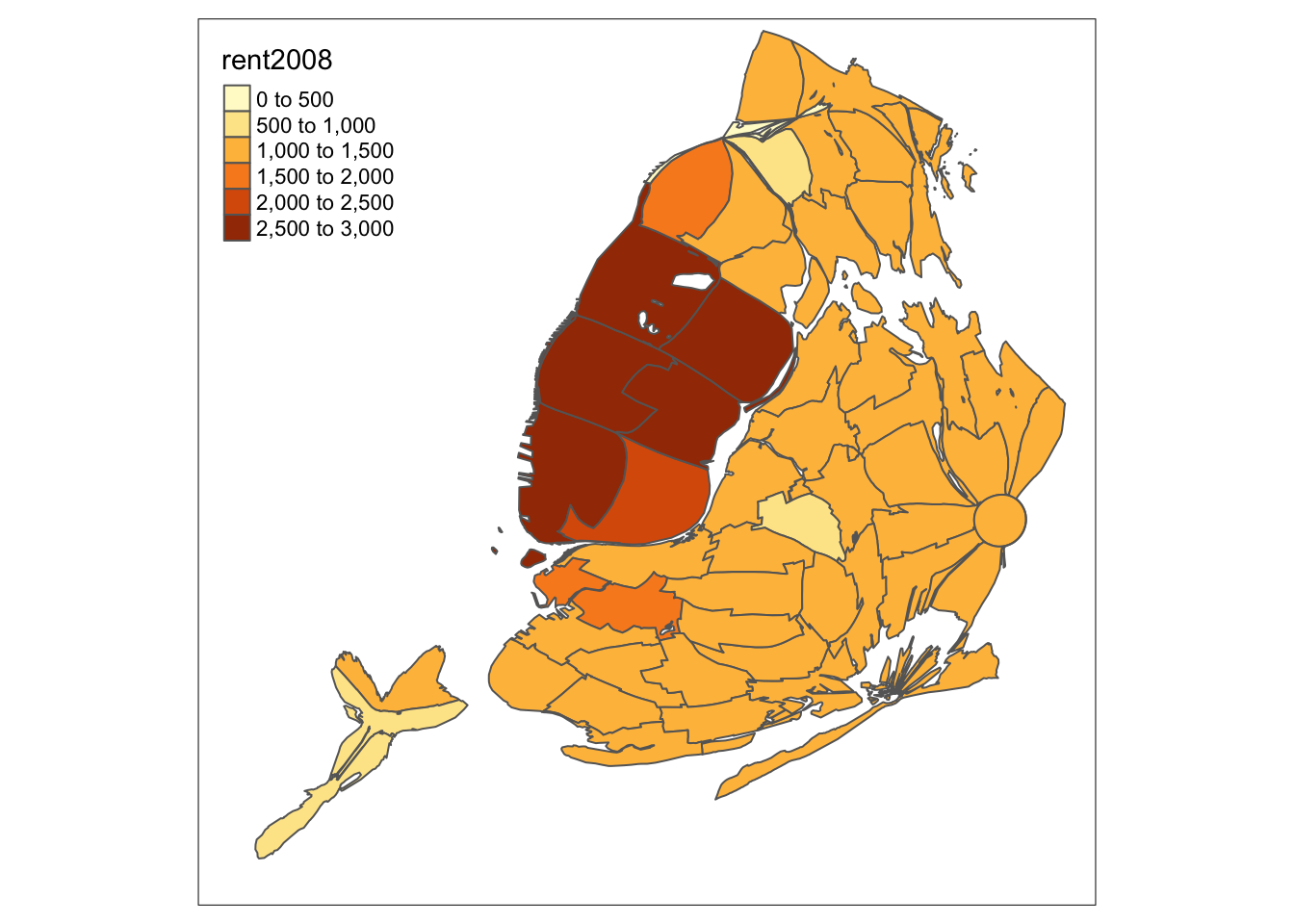
And, finally, a non-contiguous cartogram, which has the spatial units floating in space.
carto.ncont <- cartogram_ncont(nyc.bound,"rent2008")
tm_shape(carto.ncont) +
  tm_fill("rent2008") +
  tm_borders()
References
Tennekes, Martijn. 2018. “Tmap - Thematic Maps in R.” Journal of Statistical Software 84.
University of Chicago, Center for Spatial Data Science – anselin@uchicago.edu,morrisonge@uchicago.edu↩
Use
setwd(directorypath)to specify the working directory.↩Use
install.packages(packagename).↩The older function
save_tmaphas been deprecated.↩For example, in our first map, the default value for n is 5, but the pretty map that is constructed has 6 categories. Other classifications provide more control over the number of intervals.↩